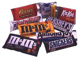
Today’s post is all about S. First here are some SWEETS for all the A-Zers. Gotta keep up your strength. Take as much as you need. Or do you prefer other nibbles? What?
Now that you have the energy, can you SAY something about these cover choices for me? It’s a Middle Grade adventure fantasy story, and I’m doing my mini SURVEY to try and decide which one of these renderings I’d go for. Not sure if I want either one. What’s your opinion? Appreciate your help.


Here’s to all the A to Z peeps who are staying the course!

I liked the first one at first: alligators are prominent as are two guys and moss.
Then I read all the comments. And … I still like the first better.
Hi Lee .. I'll have a sweetie or two another day .. but the 2nd one is my choice .. cheers Hilary
I prefer the second one. I don't know why. It seems less contrived, I guess. And it's simpler.
Lucy
Thank you for the sweets (grabs a Reese's) I vote for the top cover. I like the image of the two boys in that one, and it tells me something about the main characters.
Thanks for stopping by my blog.
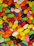
Yum! Love the Jelly Beans! Or better still, all sweets as I'm a sweet tooth!
I I love sweets! Especially kitkat and almond joy.
I think I prefer the second one. It's close though.
Yum! Hand me the Reese's and the Almond Joy, please. 🙂
I like both the covers, but the second one has my vote.
I like the first cover!! I like the ghostly figures on top of alligators – they say danger!!
Thanks for the yummy sweets! Take care
x
I'll have some Twizzlers, please!
I like the second one, although I'd make the title bigger if possible.
I prefer the second cover.
Sugar!
M &M's and I really like the second cover! Julie
Ahh, you know how to lure us poor (candy) suckers in for a vote. 🙂
I like the second cover. It lures you in (like the candy).
Teresa
The second has the look of a 70's horror story. Too creepy for a fantasy adventure
I like the reverse shadow people in the first, but how about fantasy alligators actually in the sky? Re: Fantasia?
I like the first one Cheryl. It caught my eye more than the second one.
Thank you for the Reese's. Nummers. I'm going to have to go with the second. The title in the middle separates the cover into two halves, a visual no-no. I also feel more depth in the second one where I can see the elements as a unique composition.
I like the less heavy look of the first one. The emphasis is put on that dripping moss, or whatever it is, overhead, and I half expect a gator to come crawling out on it. And seriously? The first one "feels" more professional to me.
I made my choice before reading the comments, and I see I'm sorta in the minority. It figures. 🙂
the second one–and now to the candy–can't pick just one–has to be the m&ms and the reeses cups:)
Thanks, Lynn. I can't respond to you via email, so here's my appreciation for stopping long enough to give me your opinion.
I like the second cover best…and the sweets? goodness, my downfall…I love the Reese's PB cups, the M&M's, the jelly beans, and, and, and…I really could go on…
I like the second one best. The people in the title is unique and the cover feels less crowded.
Yummy jelly beans!
Hey there- thanks for the visit and comment only blog. I like the first one without the shadow people.
Karen
I like the first one. It "feels" more middle grade and I actually like the ghostly figures up in the air. And I would like some Dove's Dark Chocolate, please.
I prefer the second – and I made up my mind before seeing the other comments 🙂
I'm going on the immediate visual impact. The first cover looks like two separate covers layered together, with the title almost hidden sandwiched in the middle. The second cover holds together better as a unified whole, and is more striking.
Thanks for the sweeties! My vote goes for the second one. I like the contrast of the green letters on the black background.
J.C. Martin
A to Z Blogger
I could go for some Swedish Fish over here. 🙂 I like the second cover much better. The shadow people in the first one just do not fit and I like the color scheme of the second one more too. The top one just has too much light in it.
How about some gummy worms? Not that I should eat them. . . I like the first cover, minus the shadow of the couple at the top.
I'll take the Reese's thank you. As for the covers. I like the second one better. The first one doesn't make sense to me. Both the title and the people are above the alligators when it feels like there should be alligators overhead. So for me, the second title fits better. At least the title (with little people in the letters) is at the top, more strongly suggesting Overhead.
I love sweets- but am happy that all the Easter candy is finally gone because I was eating way too much of it! I love chocolate though.
I looked at both covers for a while and prefer the one with the green title.
~Jess
I will pass on the sweets thanks, on a diet and doing OK. I prefer the cover with green title (second one).